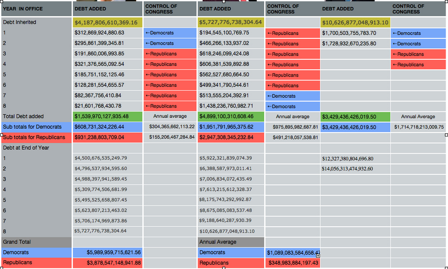
Who Spends more Democrats or Republicans?
While the Republicans have been accused of massive spending during the Bush administration, how does this compare to the Clinton and Obama administrations? One first has to realize that congress is the only government spending authority. What follows is an analysis of the spending habits when either party is in control of Congress.
It is obvious that the Bush administration spent much more than the Clinton administration, equally obvious is that the Obama administration is clearly on the heals of out spending the Bush administration, nearly reaching the first 6 year total of Bush in 1 1/2 years.
This data has been updated as of 06/15/2010
This data can all be validated at http://www.treasurydirect.gov/NP/BPDLogin?application=np

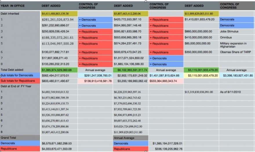
In the comparison below, the debt is awarded based on the president that created the budget, obviously the incoming President gets a free ride for the first 9 months of his administration. I added, for accuracy only the items that Obama requested and for which he signed the bill and I gave him credit for receiving one half of the TARP funds, keep in mind that the full $750 billion of TARP also show in the Bush budget for FY 2009.
The amount of money allocated for Obama starts on October 1 2009 when FY2010 began and his first budget, it represents the amount the national debt has increased thus far and does not represent a full FY
These numbers are accurate as of June, 1, 2011
The amount of money allocated for Obama starts on October 1 2009 when FY2010 began and his first budget, it represents the amount the national debt has increased thus far and does not represent a full FY
These numbers are accurate as of June, 1, 2011
Spending based on giving Full FY Budgets to President that created it
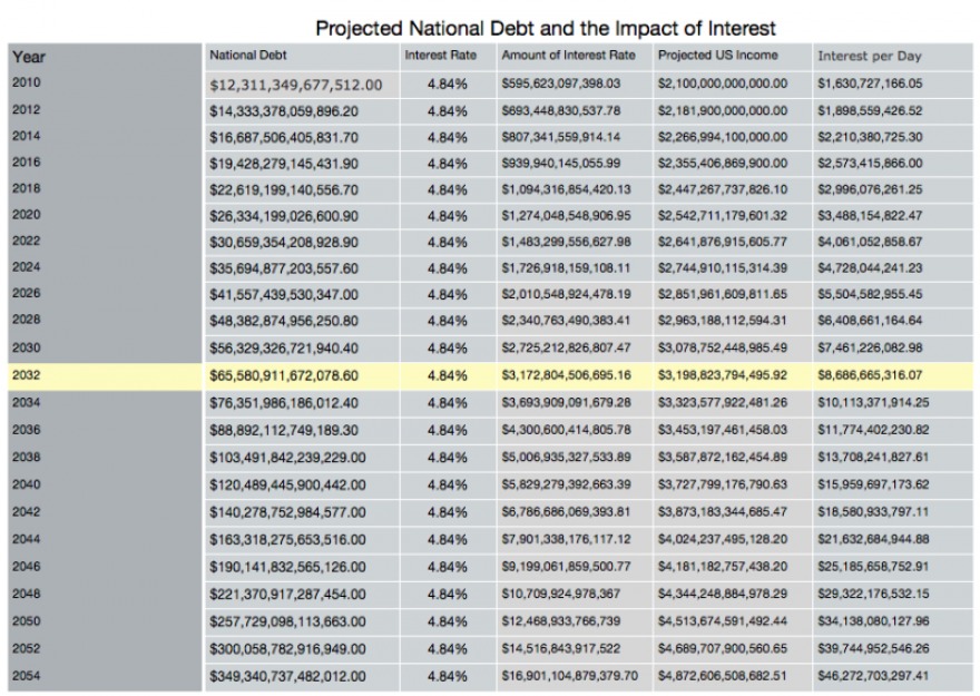
Is the current rate of the increase of our National Debt leading to our Destruction?
It is obvious that something needs to be done about our soaring debt before it becomes totally unsustainable. In 2009 the total income for the United States was about $2.1 trillion, the 10 year average shows that the governments income rises at an annual rate of 3.9%. Over the last 10 years our national debt has risen an average of 9.33% each year and our 10 year interest rate on our debt has averaged 5.3%
At some point the interest that we pay will surpass the entire income of our country unless we can convince our members of congress to start addressing this now. I used the actual National debt that the US held on the day that George W. Bush left office and have then calculated the debt using the average increase established over the last 10 years. As you can see from the spreadsheet below, in 2025 we come eerily close to having payable interest that equals our income.
In 2029 we cross that line and unless something is done to stop the bleeding we will be totally bankrupt, how ominous is that? 100 years after the start of the Great Depression
Though these numbers are mere calculations and I will up date the spreadsheet as I get more accurate information. It is important to know that we have already exceeded the calculated projection for 2011, how much we have exceeded that will not be known until December 31, 20111. You can, however, see from the counter at the top of the page our National Debt as it stands today.
June 2, 2010, I decided that I needed to fully evaluate the method of calculations that this projection seems to indicate. First, it does not seem accurate to start at a point when our current national debt already exceeds the first projection. I changed the start year at January 1, 2010 and the national debt as of December 31, 2009. Additionally I decided to research the interest rates, the ones that I have used appear to be for all debt in general. I changed this to reflect this by using the only the Interest bearing debt from the US Treasury website. I have placed a copy of the spread sheet that I created as well as a copy of the data that was previously presented below. These can be viewed here /
Changes were also made to the method of determining the rate at which the national debt increases my calculations show that in the past decade the average increase the national debt has been 7.09% annually. As aside comment 2008 and 2009 both had double digit rates of 10.15% and 15.83% respectively.
Since these years are represented every other year, I calculated as an example 2012 as 2012 = ((2010*1.079)*1.079)
The yellow line is the point that our interest rate is nearly equal to our income, this is the point of no return.
If anyone cares to have this data, I can provide it as native iWorks Numbers, PDF, XLS or CSV format, just contact me and I will send it to you in the format available.
You might notice that I added a column that shows how much interest we pay (or will pay) for each day. The math on this is very simple Interest/365.25
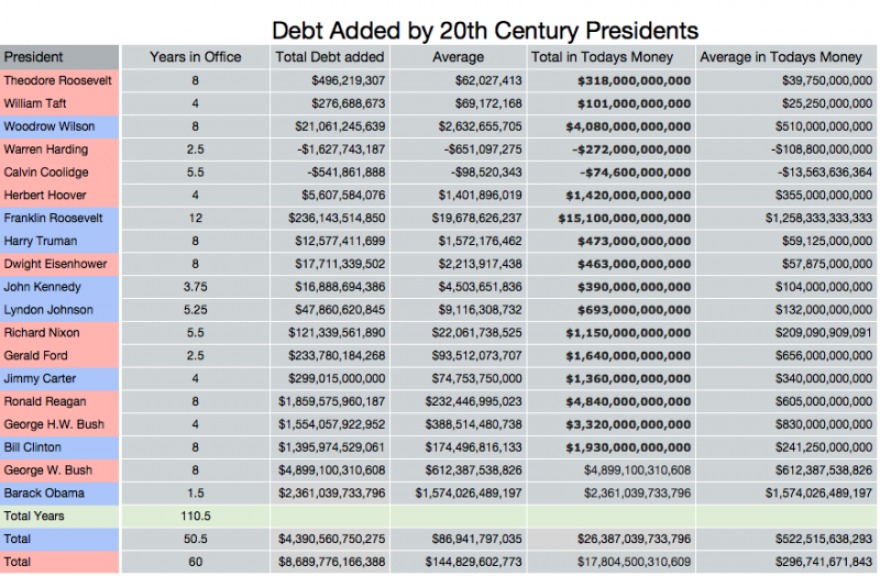
How does the spending of today compare to the spending of past Presidents
Bush has been accused of spending uncontrollably and even Obama has been accused of being ever worse. Have you ever wondered how these two would compare to the other Presidents? The spreadsheet below show the total amount added to the National Debt be each president of the 20th Century. The 'Debt Added" tab is the total debt. I have to say that these numbers are not 100% accurate. In the early 1900's the President took office in March so the numbers are reflected as the end of the year. There are of course the assassinations, where a president has not completed a full term. In the case of John Kennedy he was assassinated in November so his figures stop at the end of the fiscal year in 1963, Nixon is similar since he resigned.
I wanted to make this comparison as fair as possible since $1.00 in 1901 is not equal to $1 in 2010. I took the amount of debt added by each president and then headed over to http://www.measuringworth.com/uscompare/ using the last year of the Presidents term, I converted the value of that money to the value of money in 2009. There was no conversion for the debt added for either George W. Bush or Barack Obama.
In addition I decided to add up the debt by the political party of the president, I was not attempting to prove anything but just to look at it and see what it might bring forth.
It also appears that the only president since 1901 that has reduced the national debt is Warren Harding, you will see negative numbers in his columb
I doubt that anyone from the left would be surprised that the total debt added when a republican is president is twice as high as when a democrat is resident, actually it was almost exactly double. I also added the number of total years each political party has lead the United States, thus far that number is 60 years for the republicans and 50.5 years for the democrats.
Again, to be fair these comparisons between the parties were also made using the value of todays dollar, remarkably when that is done the spending roles are reversed. The data shows, by using todays dollar that when a democrat is president the spending is higher than when a republican is president.
The other thing that jumps out, or at least should jump out is what the cost of the Great Depression, in terms of todays dollars over the 12 year F.D.R administration spent $15 trillion and his average spending is very similar to that of current president Barack Obama.
| congress_spending_comparison.xls |
| congress_spending_comparison.pdf |
