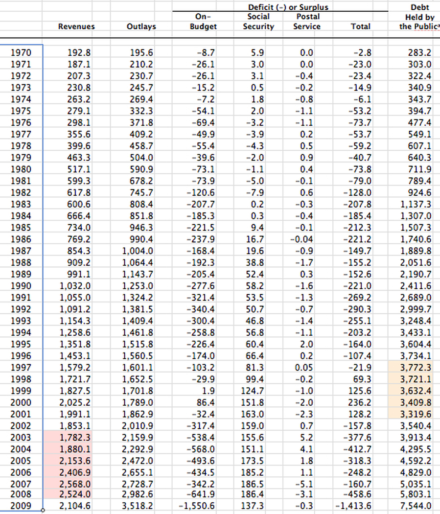
Federal Revenues for the years 1970 to 2009 from the CBO
The data represented here is a snapshot of the actual data obtained from http://cbo.gov
You will notice that there are two areas that are highlighted. The area with a slight pink ting shows the increase revenues after the Bush tax cuts made in 2003.
The area with the yellowish tinge shows the amount of debt that is held by the public. I highlighted this because there is a false premise that George Bush inherited and then squandered the budget surpluses from the Clinton administration.
It is important to note that despite having a budget surplus, each of these years also saw an increase in the national debt and this can be validated on the home page. You can see on the home page that the debt did increase, the sizes of those increases reduced in size from each proceeding year.